Sales line (01507-611065) open : Monday - Friday, 9.30am - 5.15pm.
Interior Design and the Colour Wheel

When you're decorating your house, it can be difficult to envisage the end result ahead of starting your work. How will you know whether your efforts will pay off, that your colour schemes will look good?
There's actually a really useful tool you can use to create attractive colour combinations for your interior design. It's called the colour wheel.
What makes the colour wheel so interesting and helpful is that you can use it in a number of different ways to produce the look you want to achieve. To help you out, we've put together this useful colour wheel guide.
In this tutorial, we'll show you:
- What the colour wheel is.
- How to use the colour wheel to create different colour combinations.
- How the colour wheel can be used in interior design by giving you decoration ideas and inspiration.
Ready? Let's take a closer look at the colour wheel...
The colour wheel chart
Although a powerful tool, the colour wheel is pretty simple and very easy to use. So whether you're a budding interior designer looking for new ideas, or just find yourself wanting to reinvent a room in your home, this will give you some great inspiration.
Here is the colour wheel, in all its glory:

Essentially, it's a circular (wheel shaped) diagram divided into 12 segments of different colours. These colours can be divided into three groups:
- Primary colours
- Secondary colours
- Tertiary colours
The three primary colours are those that cannot be made by mixing other colours; red, yellow and blue.
The three secondary colours are formed when two primary colours are combined equally:
- Red + yellow = orange
- Red + blue = purple
- Yellow + blue = green
The final six segments of the colour wheel are made up of the tertiary colours. These are created by combining a primary colour with a secondary colour in the ration 2:1. For example:
- 2 parts red mixed with 1 part purple creates red-purple
- 2 parts red mixed with 1 part orange makes red-orange
- 2 parts yellow combined with 1 part orange results in yellow-orange
- 2 parts yellow mixed with 1 green makes yellow-green
- 2 parts blue and 1 part purple creates blue-purple
- 2 parts blue combined with 1 part green makes blue-green
Hot and cold colours
When divided in half, the colour wheel can be split into hot and cold colours. These may sometimes be referred to as warm and cold colours.

Colour selection is critical in interior design, so consider the feelings of warmth and energy that you want to incorporate into a particular room.
Warm colours are generally more energetic and stimulating, and therefore are commonly used in the rooms of the home that are more social, such as the living room, dining room and kitchen.
On the other hand, cool colours are more calming and relaxing. They are therefore best for rooms of the house where you need to focus, concentrate or rest, such as a study, bedroom or children's nursery.
Neutral colours
In interior design, most rooms will usually be decorated in mainly neutral colours, with splashes of colour added. Neutral colours are those which don't appear on the colour wheel, such as white, cream, beige, brown and black.
Light neutral colours are a great option for your home, because they are bright and can be combined with pretty much any colour from the wheel to create something that matches your taste.
With a neutral base, you can add colour by adding coloured paint or wallpaper to a feature wall, hanging vibrant art on the walls, or using coloured furniture, cushions, curtains and rugs to achieve your desired look.
In order to ensure you get colour combinations that work, you can use the colour wheel in several ways...
Using the colour wheel for interior design
When you're decorating or renovating a room, one of the key things you'll think about is colour.
Typically, the majority of the room's décor will be in neutral colours, with combinations from the colour wheel added to create character and depth.
In order to choose colour schemes that work, there are a number of options available. Let's have a look...
Analagous colour combinations
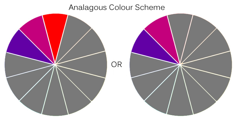
Analagous colour schemes are created by partnering two or three colours which are next to each other on the colour wheel. It is usually wise to choose one of the colours as a 'base colour' which will be more dominant, with the other colour or colours used more sparingly as supports to balance the room.
Complementary colour combinations
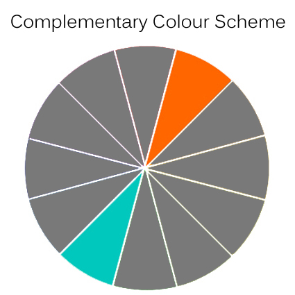
Another option is to use a complementary colour combination, which takes two colours directly opposite each other on the wheel. Every combination would include one warm colour and one cool, therefore balancing energies. One colour in a complementary scheme should be dominant, with the other used in small flashes as an accent colour.
Split-complementary colour combinations
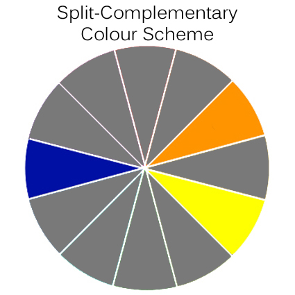
For a more subtle approach to the complementary colour scheme, a split-complementary offers a main base colour with two supporting colours, rather than just one. When you have chosen the base colour, the two colours either side of the base colour's complement would be the supporting colours.
For example, a blue base colour would be matched with yellow and orange – as shown in the diagram above.
Triadic colour combinations
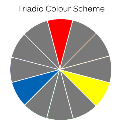
A bold colour scheme can be provided by using a triadic combination. This is where three colours which are spaced an even distance from each other on the colour wheel are used together. If the result is a little too over the top and vibrant, it can be subdued by just using two of the scheme's colours with a neutral colour as the base.
Square colour combinations
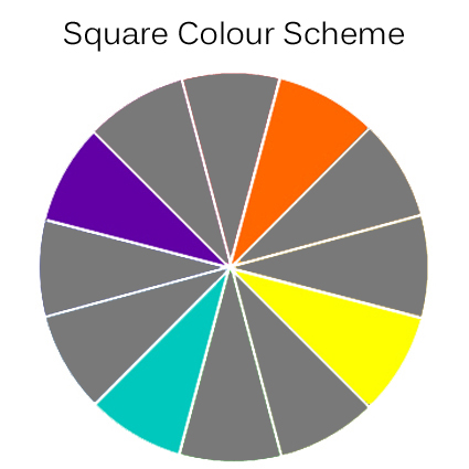
A square colour scheme is similar to a triadic combination, but this time four colours are used. The colours are spaced evenly apart on the wheel; so that they would create a square if you drew lines between them. Again, square combinations can be bold and vibrant, so you may wish to use one as a dominant colour, while the others are used as accents to add depth to the room.
Tetradic (rectangle) colour combinations
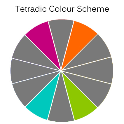
Another four colour combination comes in the form of a tetradic scheme. Also sometimes known as a rectangle colour scheme, a tetradic combination involves two pairs of complementary colours. Like with a square scheme, one colour can be used as the base colour, and others used as support.
Monochromatic colour combinations
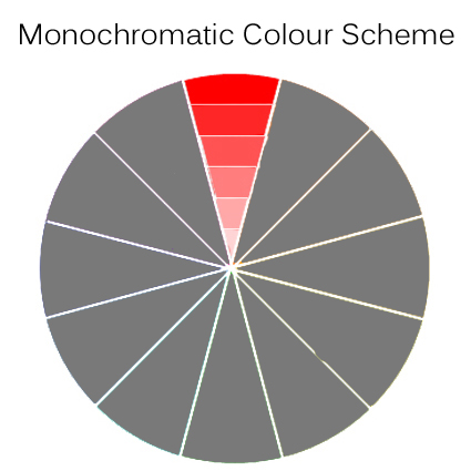
Got your heart set on just one colour? No problem – single colours can work to great effect in your home. A monochromatic colour scheme includes just one colour, though you can add depth by including various different shades of that colour.
Adding colour to your home
As we've already discussed, much of your home décor will comprise of neutral colours, usually on the walls and floors. But with your furniture and accessories, you can really put your own stamp on the home.
The colour wheel allows you to pick stunning combinations that reflect your personality and style. Here are some great ways to incorporate colour into your rooms:
- Choosing a sofa or suite with a pattern or coloured fabric can make it a focal point in your room.
- Choose your colour combination and add coloured cushions and throws to a neutral coloured sofa.
- Hang coloured curtains or blinds to incorporate colour into a neutral room.
- Use coloured bedding in a neutral bedroom, alongside a coloured headboard.
- Display artwork and wall decorations based on your chosen colour scheme.
- Buy coloured dining chairs to add a colourful splash to your dining room.

Which combinations will you choose?
If you're thinking of decorating or refurbishing any room in your home, colour will no doubt be one of your main considerations.
If you're unsure of colour schemes that match well, check through our guide to using the colour wheel. If it helps, you can even print the colour wheel chart off as you plan your different combinations.
What colour schemes would you like to see in your home? Leave a comment below and let us know how you plan to use the colour wheel!


